Coloured tapware is transforming laundries, kitchens and bathrooms into Insta-worthy style statements.
But while it’s one thing to admire the glamour of brushed brass and the boldness of matte black, executing coloured taps as part of your reno requires a little early planning. Not only is it important that you choose quality taps that have cohesion with the rest of the room, but they should also look timeless, for a space you’ll love years into the future.
So how do you take a vision of coloured tapware and bring it to life? In this guide, we step you through our own tried and true tricks and tips for embracing colourful fixtures confidently. Find out how to match colours, create contrast and use light the right way. And importantly, learn when less becomes more, so that your taps remain the undisputed star of the room.
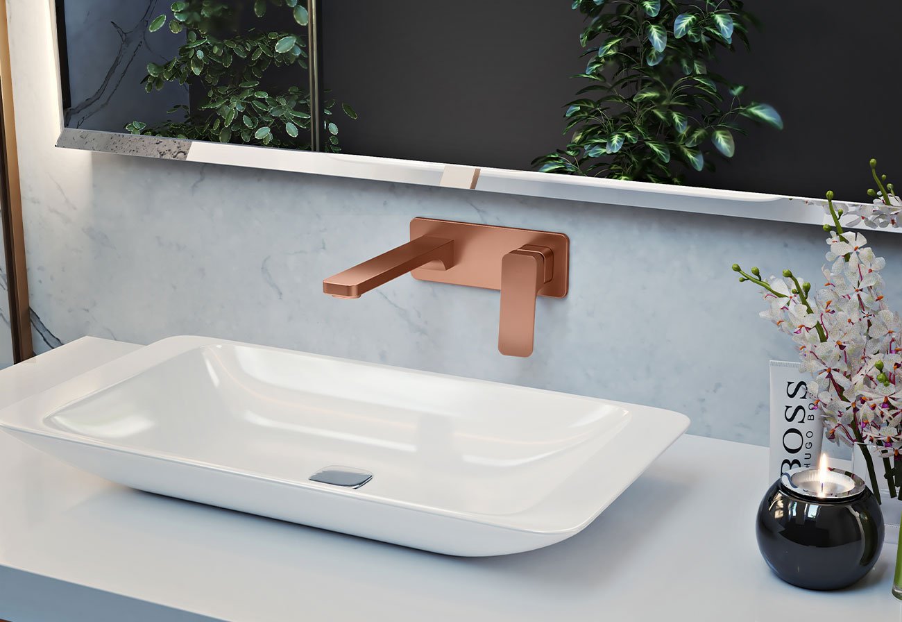
Coloured Tapware Options
While there’s always a time and place for chrome, gone are the days when it was the assumed finish for every tap in the house. Modern renovators are embracing new hues in all their glory, with tapware now recognised as a fresh way to add personality to kitchens, laundries and bathrooms.
Popular options include:
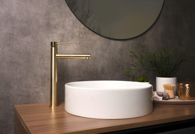
- Brushed Brass – one of the biggest tapware trends of the moment, brushed brass is a showstopper
- Brushed Copper – with artisanal, Earthy vibes, this finish works just as well in period homes as it does in modern builds
- Matte Black – a match made in heaven for minimalist and urban homes, this bold beauty is a dream to style
- Brushed Nickel – warmer than chrome and with a rustic edge, consider brushed nickel the new neutral that works in almost any space
- Gunmetal – softer than black but just as chic, this finish is sleek, edgy and right at home in industrial and modern homes
How To Make Coloured Tapware A Success Story
Using coloured tapware in a bathroom refresh or renovation involves savvy design choices that take into account functionality and style.
Having installed brushed nickel, copper and brass taps and accessories in our recent Modern Farmhouse renovation, we know what goes into making coloured taps work beautifully in any space. These are the rules we follow for the ultimate finish:
Stick with one metal per room
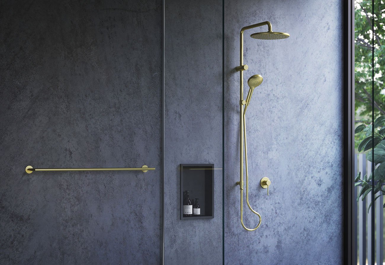
While it’s quite acceptable to mix your metal colours throughout a home, it’s best to stick with one metal per room. The reason for this is simple: cohesion.
Mismatched tapwear colours make a room feel disjointed and it’s hard to discern a focal point. However, consistent tap colours create timelessness and visual harmony.
Think of coloured tapware as the room’s anchor; it sets the tone for the space and gives you a base to build around. If you want to blend in other hues, do it with your tiles, paint or soft furnishings.
Ensure consistency with metal accessories
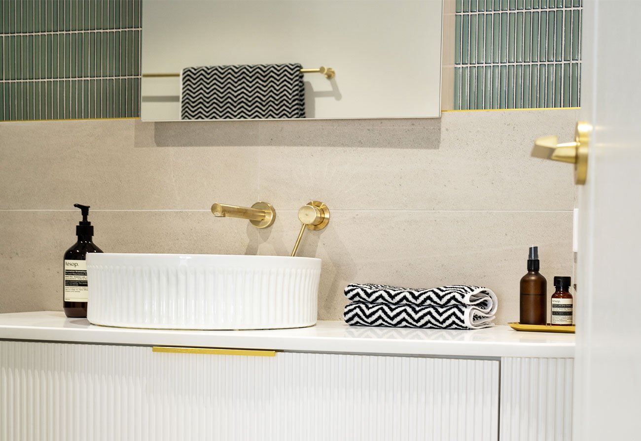
For a harmonious finish to your room, it’s best to match metal accessories like toilet roll holders and towel rails to your tapware colour. Having consistency between these essentials and your taps makes rooms feel curated and complete, plus they contribute beautifully to the overall theme.
This is where planning and research comes into the equation. Not all ranges will necessarily include every accessory you want, so allow time to find a coloured tapware range that includes all of the accessories you want in the room, from robe hooks to hand towel holders and even soap dispensers.
Add materials in contrasting shades
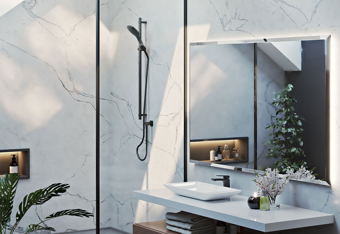
It goes without saying that if choosing coloured tapware, you want it to pop, and that means creating contrast with other items in the room.
The easiest way to create contrast with coloured taps is to have a neutral backdrop. Neutrals are considered to be muted tones of black, brown, white and grey and they provide a sophisticated canvas for virtually any type of coloured tapware.
For the more adventurous, consider adding other materials in a complementary colour to your tapware. For example, if you want your brushed copper taps to take centre stage in your new bathroom, you might consider tiles or paint in a shade of blue.
Position lighting strategically (and pick the right tone!)
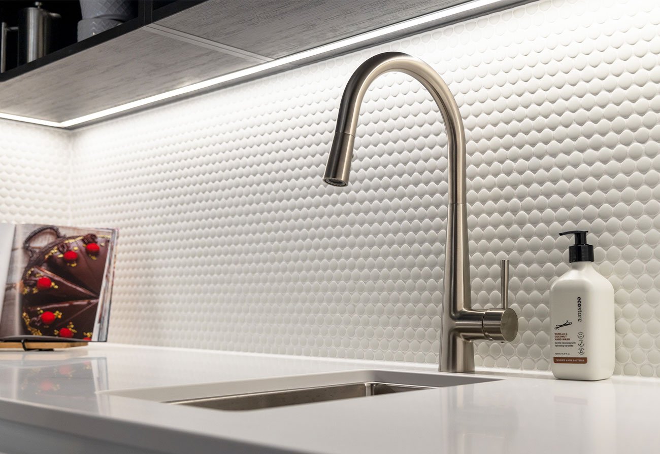
To avoid shadows, which detract from the tone, texture and shape of coloured taps, it’s best to position your lights above them rather than at an angle. Of course, ensuring this happens requires planning, so if you are about to embark on a renovation, remember to finalise your tapware before your lights!
Also keep in mind that light can be warm, cool or neutral. To enhance the colours of a tap, it’s best to try to use a matching light tone. For example, warm lighting will enhance colours like brushed copper, nickel and brass, while cool tones are fabulous for sleek tapware finishes like chrome and matte black.
Create balance with soft textures
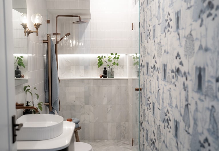
Decor plays an important role in highlighting coloured taps and elevating rooms. And the best part is that it’s one of the easiest things to change if you get it wrong!
Soft textiles like towels, mats and rugs work beautifully with the hard metallic finish of tapware. This textural contrast instantly creates a layered, luxurious and welcoming space – with the taps the focal point of the room.
When choosing your soft textures, opt for complementary or neutral shades so as not to detract from the colour of the taps.
Pair coloured tapware with natural (or natural-look) surfaces
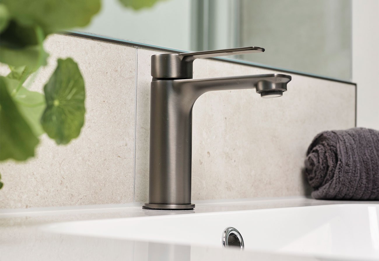
Coloured taps are a match made in heaven for natural surfaces like marble and granite. Not only does the contrast of coloured metals work beautifully with neutral surfaces, but it’s the answer to a high-end space in which each element has a chance to shine.
And always choose quality finishes
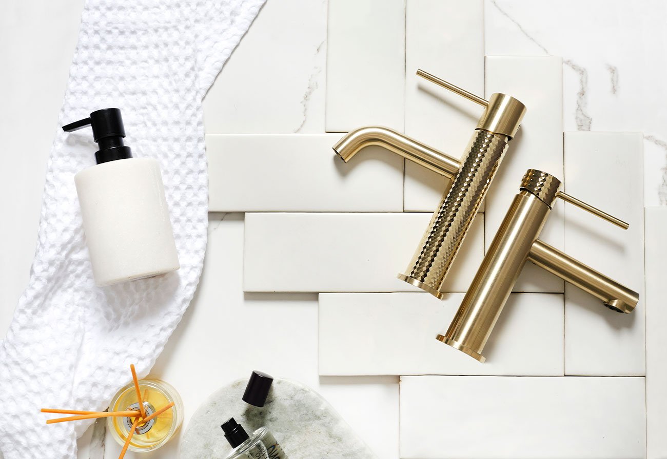
Like so many other parts of a renovation, you get what you pay for with tapware. Don’t pounce at the lowest price, take a beat to consider the materials used, the type of finish and the warranties before committing to products.
“I’ve been renovating to decades and my motto for bathrooms is to never skimp when it comes to taps. Save on tiles, save on furnishings, but always buy quality tapware.” (Nikki from the Making HOME team)
Not only will quality tapware function smoothly and give you the longevity you want, but it also looks great for longer. Remember, taps are workhorses and need to stand up to daily wear and tear and remain the star of the room well into the future.
WOM Network is working with Greens Tapware to bring you this article. Expertly designed in New Zealand for the modern lifestyle, Greens Tapware proudly sits at the forefront of technological tapware innovation and trends through constant research and innovation.
This article first appeared on Making HOME.





-

-
-
Ellen said
- 26 Oct 2024
-

-
-
mom93821 said
- 25 Oct 2024
-

-
-
mom465794 said
- 24 Oct 2024
-

-
-
ChiWren said
- 23 Oct 2024
-

-
-
mom486197 said
- 23 Oct 2024
Post a comment8:20 am
-

-
-
mom93821 replied
- 29 Oct 2024 , 6:44 am
Reply6:44 am
5:39 pm
2:49 pm
1:25 pm
To post a review/comment please join us or login so we can allocate your points.