While many people lean towards neutral shades for their new kitchens, some of us prefer to splash some colour in the heart of the house. With this in mind, Kaboodle Trends has launched in Australia, allowing renovators to add more colour to their doors and panels and bring the experiences of the world to their kitchen.
Developed in collaboration with interior designer, Jono Fleming, Kaboodle Trends introduces six breathtaking colours to its innovative DIY kitchen range. Spanning four key trends, the colours are inspired by travel adventures and nostalgia and they invite homemakers to celebrate the special people, cultures and experiences that make up their lives.
Themes and colours available for a limited time in Kaboodle doors and panels include:
- Indulge: Paprika and Candy Floss
- Connect: Tagine
- Embrace: Edamame and Walnut
- Celebrate: Mostaza
Let’s take a closer look at these six gorgeous shades and how to use them in styling your unique and affordable kitchen.
Kaboodle Trends: Indulge
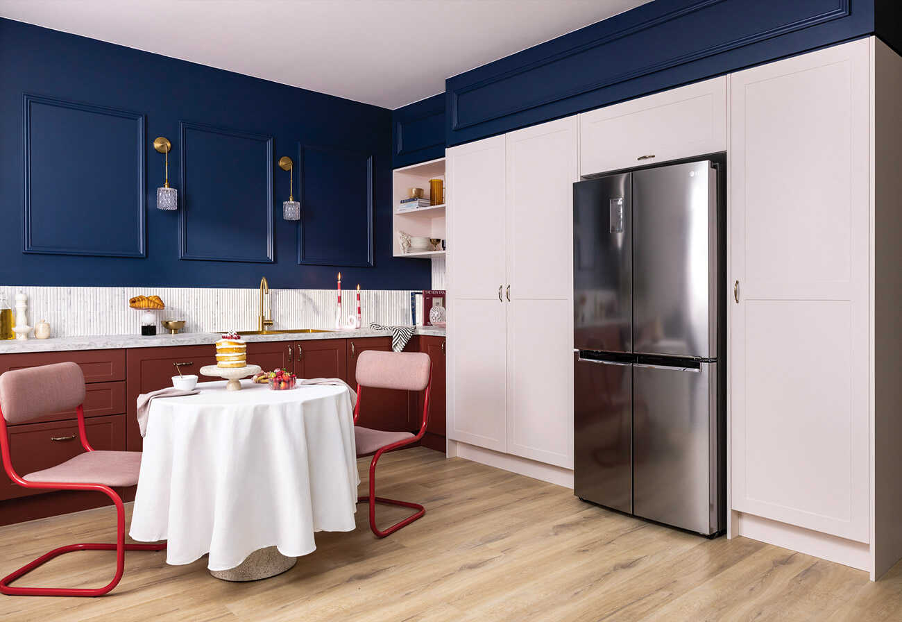
Incorporating the warm, trending hues of Paprika and Candy Floss, the Indulge trend dives deep into travel nostalgia. Reminiscent of opulence and charm from around the world, these are colours that create a distinctive and unique finish that will have guests gushing.
- Colours: Paprika and Candy Floss
- Material: Premium thermoformed
- Profiles: Modern, Apine, Country and Heritage
Kaboodle Trends: Connect
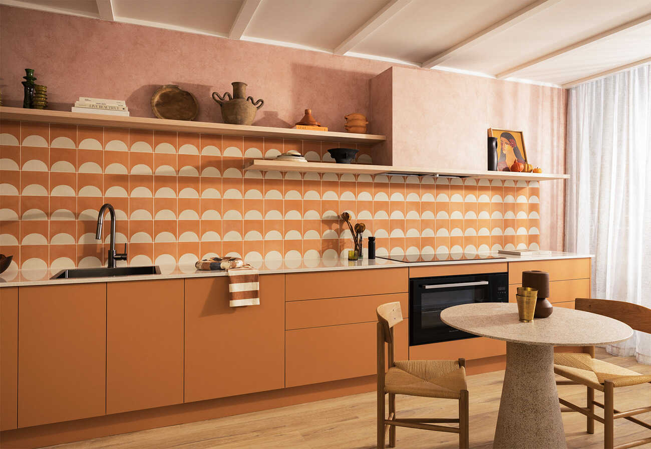
Zesty, earthy and vibrant, Connect introduces Tagine to the Kaboodle lineup – and boy, does it pop! The philosophy behind this colour choice is rooted in our re-connections with friends and family after the recent world events. As visually rich as the souks of Marrakech, this is a brave choice for fans of big colour.
- Colour: Tagine
- Material: Premium melamine
- Profiles: Modern
Kaboodle Trends: Embrace
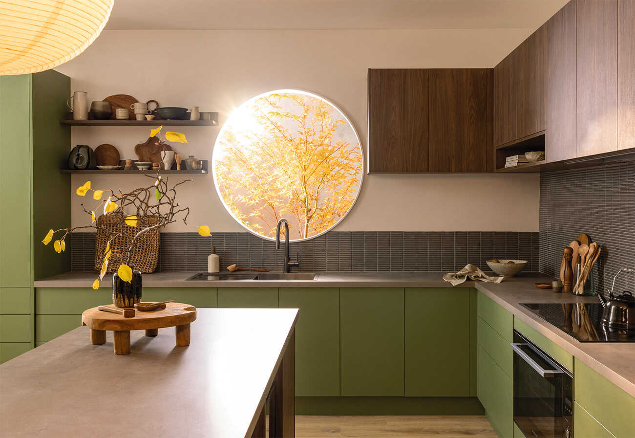
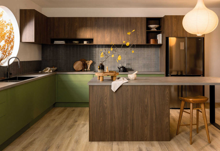
The Embrace theme includes two new shades of Edamame and Walnut, ideal for Japandi and Modern Country interiors. The colours reflect our focus on wellness and positivity as well as the importance of our natural environment. Texture-rich and calming, this stunning combination of earth shades is a match made in heaven.
- Colours: Edamame and Walnut
- Material: Premium melamine
- Profiles: Modern
Kaboodle Trends: Celebrate
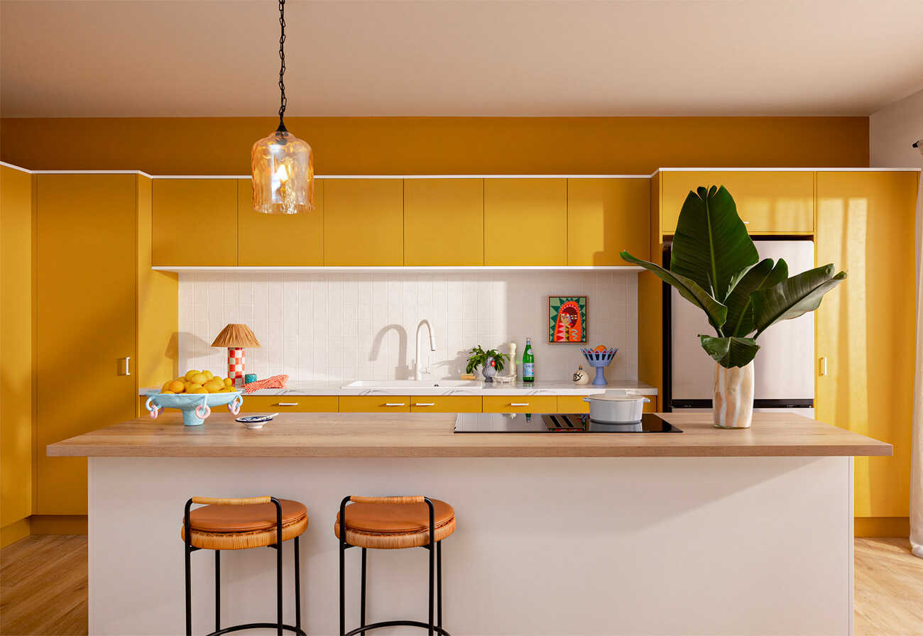
Festive vibes entwine with the aromas of travel in the Celebrate theme, which brings the vibrance of mustard-yellow to Australian kitchens. Kaboodle describes the colour as being culturally rich, evoking the colours, smells, sights and sounds of South America’s flamboyant festivals. Pair it with timber accents, a white bench and modern kitchen handles in matte black for a design that screams “celebration!”.
- Colour: Mostaza
- Material: Premium melamine
- Profiles: Modern
How To Order From The Kaboodle Trends Range
The beauty of the Trends range is you can mix and match with other Kaboodle colours to create a space that’s uniquely yours. Either purchase modular doors and panels directly from a Bunnings store near you, or make a booking with a Bunnings Design Consultant to order customised sizing.
Kaboodle is a partner of the Making HOME renovation series.
Top image: Kaboodle Trends Embrace
Chosen your new sink yet? Take a peek at our favourite farmhouse sinks available right now in Australia.
This article first appeared on Making HOME.




8:38 am
8:14 am
5:14 pm
4:03 pm
8:22 pm
11:54 am
10:46 am
7:13 pm
5:24 pm
2:25 pm
12:48 pm
9:41 am
-

-
-
Ellen replied
- 31 Aug 2023 , 7:43 am

Reply8:51 am
6:46 am
-

-
-
mom93821 replied
- 31 Aug 2023 , 5:51 am
Reply5:42 am
3:57 am
10:14 pm
9:32 pm
5:29 pm
- 1
- 2
- »
Post a commentTo post a review/comment please join us or login so we can allocate your points.