


Colour. We see it all the time, but how often do we consider or consciously use it to create positive change? Colour has the power to not only enhance the look and feel of a physical space but also offer a newfound purpose and intention for the area – whether it be a bedroom, bathroom or even a classroom!
Australia’s leading colour and paint expert Dulux understands how powerful colour can be, which is why they’ve partnered up with leading preventative mental health not-for-profit Smiling Mind to support the implementation and education of the role spaces and colour can play in supporting positive environments for learning and emotional wellbeing, alongside social and emotional learning resources in schools.
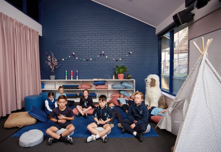
Together, Smiling Mind and Dulux have developed a free Smiling Mind Spaces Toolkit equipped with resources to help educators create dedicated mindfulness areas in schools using colour.
The Toolkit is divided into five core themes from the Smiling Mind Mindfulness Curriculum – awareness, the senses, a curious mind, gratitude and resilience – which are paired with curated colour palettes developed by Dulux, along with tips on where and how to create mindfulness spaces. Take a look at each theme below:
1. Awareness
According to clinical psychologist and Smiling Mind CEO, Addie Wootten, awareness is the insight that arises when we pay attention to the present moment with openness, curiosity and without judgment.
“Introducing mindfulness to students often starts with a focus on building awareness. We ask them to learn how to turn their awareness to one thing at one time and we use the senses to help guide that awareness. Providing a space for students to learn to slow down, pause and build awareness of their breathing, what they can hear or smell, can provide a powerful opportunity to build their ability to focus and pay attention, which is critical for awareness.”
The Awareness colour palette, created in collaboration with Dulux, features soft and subtle natural colours, like Dulux Ellen, Sea Breeze and Silver Grass. All pastels, these colours can be used as a main feature wall or together in different combinations to add a sense of calm and simplicity to any room.
Dulux’s Colour and Communications Manager, Andrea Lucena-Orr suggests, “another great way to introduce pastel colours is through your interior décor, with soft furnishings like cushions and throws to really carry out that calm ambiance – perfect as a small nook in a classroom or library.
2. The Senses
Children learn best when they engage their senses, so providing opportunities for children to actively use their senses, whether in the classroom or in the playground, is essential.
“Our senses provide an instant doorway into mindfulness. Noticing what we can see, hear, smell, feel and taste in any given moment brings us into the present. We start to notice more details of the world around us: the people, places and events of our lives,” says Addie.
The Senses palette features a range of strong, robust colours – including Dulux Carmen Miranda, Very Cherry, and Orangeade – chosen to help stimulate the senses and, if outdoors, complement the natural surroundings.
“These colours are deep, rich, and have the ability to bring a sense of warmth to any space – both indoors and out,” says Andrea. “I love injecting warm colours as accents, to really make a statement. Start with a warm neutral like Limed White Half on the walls, with strong coloured furnishings and accessories to make your senses ignite.”
3. Gratitude
Fostering a mindset of gratitude is an essential part of emotional development.
“Typically speaking, children who are grateful tend to be happier, more optimistic, and report more satisfaction with their schools, families, communities, friends and themselves,” says Addie. “Gratitude carries with it an abundance of positive outcomes in social-emotional learning and plays a critical role in happiness and health. So, laying the foundations early for children to develop and practice this skill is important.”
The Gratitude colour palette by Dulux features a selection of subtle, cool tones, including blues, purples, and greens. “Lighter tones, like Dulux Opus, Vanilla Ice and Pale Tendril, can create a peaceful surrounding and provide balance between stimulation and serenity – perfect for inspiring gratitude in children,” says Andrea.
4. A Curious Mind
Curiosity is essential when it comes to mindfulness. Being able to see things with fresh eyes and intrigue allows us to view things as if for the first time and with greater appreciation.
“Primary school-aged children often have active imaginations and use their curiosity to explore their feelings and the world around them. When children explore their curiosity, they expand their vocabulary as they use language to describe what they’re thinking, seeing, hearing or experiencing,” explains Addie.
To help spark a sense of curiosity, Dulux has developed a lovely, bright colour palette with tones of greens, reds, blues, and complementary neutrals. “These colours have the ability to energise the body and excite the mind, which is why they were chosen for this palette,” says Andrea. “We opted for hues such as Dulux Gizmo, Mulberry Mix and Olive Reserve as they can add warmth and energy to any space.
“When it comes to colour, especially bright ones, it’s all about balance. So, when applying these colours to your interiors, it’s best to choose a neutral you want to pair it with. By choosing your neutral, you’ll be able to keep those brights in perfect balance.”
5. Resilience
When we talk about resilience, we’re talking about a child’s ability to cope with the ups and downs of daily life, and how they bounce back from the challenges they experience.
“Building resilience is so important in children – it helps them not only deal with current difficulties in everyday life but also develop the basic skills and habits that will help them deal with challenges later in life,” says Addie.
The Resilience colour palette by Dulux offers a balance of stronger colours, like Dulux Burnished Bark, and lighter, softer colours, like Lip Gloss Half, which make for a striking combination in both indoor and outdoor settings.
“The reds, pinks, dark and light blues in the Resilience palette evoke a sense of strength, security and safety – emotions that are sure to encourage resilience in the classroom.
“I like using lighter tones for main and feature walls, as this can make spaces feel larger. Keep your strong tones for furnishings and repeat the light tones in smaller ways to balance the space,” Andrea adds.
For more information on the Smiling Mind Spaces program and Toolkit, head to the website here.
ABOUT THE SMILING MIND TOOLKIT: Launched in June, the initiative was developed by a team of Smiling Mind psychologists, alongside Aussie educators and Dulux colour experts who created a free downloadable Toolkit to support parents, educators, carers, and the wider school community to create physical spaces and environments for children to help nurture their wellbeing at school.
This article is shared and powered by
![]()


4:13 pm
1:53 pm
1:51 pm
6:20 am
1:12 pm
7:17 pm
7:08 am
3:15 pm
4:01 pm
10:34 pm
7:36 am
9:28 pm
10:27 am
8:08 pm
1:28 pm
10:57 am
2:20 pm
10:47 am
12:32 am
12:04 am
- 1
- 2
- »
Post a commentTo post a review/comment please join us or login so we can allocate your points.